
Case Study
Learn More
Simplifying Symplifica
Simplifying Symplifica
Bringing Clarity, Compassion, and Compliance to Domestic Work in Colombia
Bringing Clarity, Compassion, and Compliance to Domestic Work in Colombia

Next Case Study
Next Case Study
Reimagining Roku
Advancing Roku’s mobile app into a social second-screen hub. Focused on creating a more engaging, user-centered experience beyond your standard remote with features that connect, organize, and personalize streaming for over 145M users.

Project Summary
Project Summary
Project Summary
Role
Learn More
Client
Learn More
Tools
Learn More
Duration
Learn More
UX/UI Designer, Researcher, Figma Lead
Symplifica
Figma, FigJam, Photoshop
3 weeks
Role
Learn More
Client
Learn More
Tools
Learn More
Duration
Learn More
UX/UI Designer, Researcher, Figma Lead
Symplifica
Figma, FigJam, Photoshop
3 weeks
Symplifica is a Colombian company that exists at the intersection of care, legality, and empowerment. Its platform helps individuals legally hire domestic workers, granting access to social security, pensions, health insurance, and formal protections.
It’s a mission-driven company that not only simplifies compliance for employers, but provides real, life-changing support for domestic workers through mental health services, educational benefits, and reporting tools for workers' safety.
But while the platform offers massive value, the experience wasn’t always intuitive and users were struggling to see that value clearly. We partnered with Symplifica to redesign key parts of their app, reduce confusion, and make the process of hiring and supporting domestic workers easier, safer, and more transparent.

Note: As this is a Columbian-based client, the majority of the original language (Spanish) language has been modified to English, and all Columbian-specific terminology have been translated to best represent its closest equivalent within the United States. Some assets, including those provided by the client, are not translated.
THE PROBLEM
THE PROBLEM
OUR MISSION
OUR MISSION
Most users come to Symplifica with genuine care for their employees, but quickly get stuck. The app experience, while full of value, was often too complex to navigate causing:
Overloaded call centers
User abandonment of the enrollment process
Hesitation to commit to premium membership because of uncertainty about the perks it offers
Our goal was to design a better, smoother experience that meets users where they are - and helps them follow through on what they already want to do: care for others. So, We set out to solve three key challenges:
Minimize support call volume by clarifying core app tasks.
Simplify the enrollment process to boost completion rates.
Communicate the value of Symplifica’s PRIME membership with empathy and clarity.
Symplifica is a Colombian company that exists at the intersection of care, legality, and empowerment. Its platform helps individuals legally hire domestic workers, granting access to social security, pensions, health insurance, and formal protections.

It’s a mission-driven company that not only simplifies compliance for employers, but provides real, life-changing support for domestic workers through mental health services, educational benefits, and reporting tools for workers' safety.
But while the platform offers massive value, the experience wasn’t always intuitive and users were struggling to see that value clearly. We partnered with Symplifica to redesign key parts of their app, reduce confusion, and make the process of hiring and supporting domestic workers easier, safer, and more transparent.

Note: As this is a Columbian-based client, the majority of the original language (Spanish) language has been modified to English, and all Columbian-specific terminology have been translated to best represent its closest equivalent within the United States. Some assets, including those provided by the client, are not translated.
Role
Learn More
Role
Learn More
UX Designer,
UI Designer,
Researcher,
Project Manager
Client
Learn More
Client
Learn More
Symplifica
Tools
Learn More
Tools
Learn More
Figma, FigJam,
Photoshop
Duration
Learn More
Duration
Learn More
3 weeks
The Design Process
My UX design process follows a four-phase approach: Discover, Define, Design, and Deliver. The Discover phase focuses on understanding the problem space through product research, surveys, competitive analysis, user interviews, affinity mapping, and card sorting. In the Define phase, I analyze the gathered information to create user personas, problem statements, sitemaps, user flows, and journey maps. The Design phase involves creating sketches, wireframes, high-fidelity designs, and prototypes, followed by usability testing. Finally, the Deliver phase includes presentations and recommendations based on the insights and validated solutions generated throughout the process.
DISCOVER
DEFINE
DESIGN
DELIVER
Product research
Competitive analysis
User interviews
Affinity map
Stakeholder interviews
Card sort
Heuristics evaluation
User flow
Journey map
User persona
Sitemap
Problem statement
Wireframes
Sketches
Hi-fidelity design
Prototyping
Usability testing
Recommendations
Presentation
Next Steps
Symplifica is a Colombian company that exists at the intersection of care, legality, and empowerment. Its platform helps individuals legally hire domestic workers, granting access to social security, pensions, health insurance, and formal protections.


It’s a mission-driven company that not only simplifies compliance for employers, but provides real, life-changing support for domestic workers through mental health services, educational benefits, and reporting tools for workers' safety.
But while the platform offers massive value, the experience wasn’t always intuitive and users were struggling to see that value clearly. We partnered with Symplifica to redesign key parts of their app, reduce confusion, and make the process of hiring and supporting domestic workers easier, safer, and more transparent.
Note: As this is a Columbian-based client, the majority of the original language (Spanish) language has been modified to English, and all Columbian-specific terminology have been translated to best represent its closest equivalent within the United States. Some assets, including those provided by the client, are not translated.
Symplifica is a Colombian company that exists at the intersection of care, legality, and empowerment. Its platform helps individuals legally hire domestic workers, granting access to social security, pensions, health insurance, and formal protections.
It’s a mission-driven company that not only simplifies compliance for employers, but provides real, life-changing support for domestic workers through mental health services, educational benefits, and reporting tools for workers' safety.
But while the platform offers massive value, the experience wasn’t always intuitive and users were struggling to see that value clearly. We partnered with Symplifica to redesign key parts of their app, reduce confusion, and make the process of hiring and supporting domestic workers easier, safer, and more transparent.
Note: As this is a Columbian-based client, the majority of the original language (Spanish) language has been modified to English, and all Columbian-specific terminology have been translated to best represent its closest equivalent within the United States. Some assets, including those provided by the client, are not translated.
THE PROBLEM
THE PROBLEM
OUR MISSION
OUR MISSION
Most users come to Symplifica with genuine care for their employees, but quickly get stuck. The app experience, while full of value, was often too complex to navigate causing:
Overloaded call centers
User abandonment of the enrollment process
Hesitation to commit to premium membership because of uncertainty about the perks it offers
Our goal was to design a better, smoother experience that meets users where they are - and helps them follow through on what they already want to do: care for others. So, We set out to solve three key challenges:
Minimize support call volume by clarifying core app tasks.
Simplify the enrollment process to boost completion rates.
Communicate the value of Symplifica’s PRIME membership with empathy and clarity.
Research
Learn More
Research
Learn More
Research
Learn More
Digging Deeper
Digging Deeper
How We Uncovered the Real Story
How We Uncovered the Real Story

We looked at wide range of global competitors with similar product offerings including freelancing platforms, payment processing services, billing solutions, applicant time tracking and benefits reporting services, as well as market-specific competitors within Latin America.
We looked at wide range of global competitors with similar product offerings including freelancing platforms, payment processing services, billing solutions, applicant time tracking and benefits reporting services, as well as market-specific competitors within Latin America.
We narrowed our focus to three key competitors who offered products and services that were the most closely aligned with Symplifica's strategy and offerings - Hogaru, Gusto, and Taskrabbit. From there, we completed a detailed analysis to help us better understand market positioning and spot opportunities.
We narrowed our focus to three key competitors who offered products and services that were the most closely aligned with Symplifica's strategy and offerings - Hogaru, Gusto, and Taskrabbit. From there, we completed a detailed analysis to help us better understand market positioning and spot opportunities.
Scanning the Cometitve Landscape
To better understand where we could bring the most value to users, we started with a three-fold research approach including competitive analysis, user interviews, and stakeholder interviews. This way were could comprehensively understand the needs of users and stakeholders while positioning Symplifica effectively within the market.


The results told us that Symplifica’s unique focus on formalization and worker protection gave it a compelling edge if we could bring that story to the surface.
The results told us that Symplifica’s unique focus on formalization and worker protection gave it a compelling edge if we could bring that story to the surface.
Listening to the People Who Use It
Listening to the People Who Use It
We conducted interviews with users to gather insights into user experiences as an employer, an employee - or both! This helped us uncover common motivations for using the app as well as recurring pain points, such as concerns about upfront costs, turnover, and workplace safety.
We conducted interviews with users to gather insights into user experiences as an employer, an employee - or both! This helped us uncover common motivations for using the app as well as recurring pain points, such as concerns about upfront costs, turnover, and workplace safety.
Key User Concerns
Key User Concerns
Turnover & Retention
Benefits & Compensation
Workplace Safety & Fairness
App Learning Behavior
Turnover & Retention
Benefits and Compensation
Workplace Safety and Fairness
App Learning Behavior
Turnover & Retention
Benefits and Compensation
Workplace Safety and Fairness
App Learning Behavior
The results were clear: Navigation was cluttered with six icons that didn’t reflect user logic. Prime benefits were buried instead of highlighted. Design was inconsistent: Fonts, icons, and flows varied across the platform. Color contrast did not meet accessibility standards. Help resources were tricky to find causing users uncertainty as to whether they were making the right decisions throughout the process. These findings confirmed what users had told us and gave us tangible areas to improve.
The results were clear: Navigation was cluttered with six icons that didn’t reflect user logic. Prime benefits were buried instead of highlighted. Design was inconsistent: Fonts, icons, and flows varied across the platform. Color contrast did not meet accessibility standards. Help resources were tricky to find causing users uncertainty as to whether they were making the right decisions throughout the process. These findings confirmed what users had told us and gave us tangible areas to improve.
“High turnover would be difficult to deal with for the sake of constantly finding new employees.”

“High turnover would be difficult to deal with for the sake of constantly finding new employees.”
“High turnover would be difficult to deal with for the sake of constantly finding new employees.”
“I try to make sure there are additional perks (when working for me) because it matters to take that stress off of somebody.”

“I try to make sure there are additional perks (when working for me) because it matters to take that stress off of somebody.”
“I try to make sure there are additional perks (when working for me) because it matters to take that stress off of somebody.”
“I like to spend time navigating through it and learning the features.”

“I like to spend time navigating through it and learning the features.”
“I like to spend time navigating through it and learning the features.”
“I have had many workplace disputes. As a woman, I faced a lot of sexual harassment.”

“I have had many workplace disputes. As a woman, I faced a lot of sexual harassment.”
“I have had many workplace disputes. As a woman, I faced a lot of sexual harassment.”
Talking to the People Behind It
To complement our user research, we conducted interviews with key stakeholders at Symplifica, including members of leadership and customer support. These conversations provided valuable internal perspectives that helped contextualize user behavior and align business goals with user needs.
A recurring theme in these discussions was user confusion around documentation and unexpected fees, issues that had also surfaced in earlier feedback. However, we also uncovered two critical insights.
Users abandoning the app
Users abandoning the app
Users abandoning the app
The majority of users were abandoning the app during the employee enrollment process, pointing to a major friction point in the user journey.
users abandon the enrollment process

80%

users abandon the enrollment process
80%
users abandon the enrollment process
80%
Unrealized benefits
Unrealized benefits
Unrealized benefits
There was a lack of clarity around the benefits associated with the platform’s top-tier “Prime” membership currently hidden in the app. This hindered engagement and potentially undermined trust and retention among the platform’s most invested users.
Surfacing the Usability Gaps
We conducted follow-up usability testing focused on key, predefined tasks to better understand current pain points and uncover navigation challenges within the app. This testing surfaced critical issues users faced, such as difficulties affiliating an employee and finding support in the Help Center. Key insights included:

We conducted follow-up usability testing focused on key, predefined tasks to better understand current pain points and uncover navigation challenges within the app. This testing surfaced critical issues users faced, such as difficulties affiliating an employee and finding support in the Help Center. Key insights included:
Users repeatedly misclicked, unsure where to start.
A lack of trust in UI labels. Users were second-guessing themselves.
Prime features were ignored or misunderstood.
These findings underscored the need to redesign the experience with clarity, focus, and confidence-building interactions. Guided by these insights, we proceeded with a heuristic evaluation to identify additional usability and accessibility issues, and aligned on four opportunities for meaningful design improvements.
Users repeatedly misclicked, unsure where to start.
A lack of trust in UI labels—users second-guessed themselves.
Prime features were ignored or misunderstood.
These findings underscored the need to redesign the experience with clarity, focus, and confidence-building interactions. Guided by these insights, we proceeded with a heuristic evaluation to identify additional usability and accessibility issues, and aligned on four opportunities for meaningful design improvements.
Contrast, Repitition, Alignment, Proximity
Screen lacks clear structure making it difficult for users to scan and understand the content. Inconsistent alignment and poor proximity between related elements disrupt the natural reading flow. Minimal contrast and weak repetition of styles reduce clarity and cohesion across the interface.
1


Accessibility Compliance
Interface elements, including normal and large text, and UI components failing to meet WCAG AA and AAA contrast guidelines. This lack of contrast can significantly impact readability, especially for users with visual impairments, reducing overall usability and accessibility.
2
Aesthetic and Minimalist Design
Lack of visual hierarchy and cohesion due to inconsistent design choices and icon use. The cluttered layout and stylistic noise were detracting top-tier members from their exclusive benefits which were not being optimally highlighted, and the overwhelming interface was reducing user focus on key tasks.
3


Consistency and Standards
Inconsistent button styles, colors, and component labeling breaking usability conventions and introducing friction. This lack of standardization can confuse users and make navigation feel unpredictable, increasing cognitive load.
4
The results were clear: Navigation was cluttered with six icons that didn’t reflect user logic. Prime benefits were buried instead of highlighted. Design was inconsistent: Fonts, icons, and flows varied across the platform. Color contrast did not meet accessibility standards. Help resources were tricky to find causing users uncertainty as to whether they were making the right decisions throughout the process. These findings confirmed what users had told us and gave us tangible areas to improve.
The results were clear: Navigation was cluttered with six icons that didn’t reflect user logic. Prime benefits were buried instead of highlighted. Design was inconsistent: Fonts, icons, and flows varied across the platform. Color contrast did not meet accessibility standards. Help resources were tricky to find causing users uncertainty as to whether they were making the right decisions throughout the process. These findings confirmed what users had told us and gave us tangible areas to improve.
Contrast, Repitition, Alignment, Proximity
Screen lacks clear structure making it difficult for users to scan and understand the content. Inconsistent alignment and poor proximity between related elements disrupt the natural reading flow. Minimal contrast and weak repetition of styles reduce clarity and cohesion across the interface.
1
Accessibility Compliance
Interface elements, including normal and large text, and UI components failing to meet WCAG AA and AAA contrast guidelines. This lack of contrast can significantly impact readability, especially for users with visual impairments, reducing overall usability and accessibility.
2
Aesthetic and Minimalist Design
Lack of visual hierarchy and cohesion due to inconsistent design choices and icon use. The cluttered layout and stylistic noise were detracting top-tier members from their exclusive benefits which were not being optimally highlighted, and the overwhelming interface was reducing user focus on key tasks.
3
Consistency and Standards
Inconsistent button styles, colors, and component labeling breaking usability conventions and introducing friction. This lack of standardization can confuse users and make navigation feel unpredictable, increasing cognitive load.
4
The results were clear: Navigation was cluttered with six icons that didn’t reflect user logic. Prime benefits were buried instead of highlighted. Design was inconsistent: Fonts, icons, and flows varied across the platform. Color contrast did not meet accessibility standards. Help resources were tricky to find causing users uncertainty as to whether they were making the right decisions throughout the process. These findings confirmed what users had told us and gave us tangible areas to improve.
Define
Learn More
Define
Learn More
Designing for Intention, Empowering Through Simplicity
Meeting the Persona Behind the Design
Our next step was to take all of the valuable insights and conduct an affinity mapping session to group user quotes, behaviors, and frustrations into meaningful categories that would factor into our user persona. Four themes emerged:
Fear of wasting money due to employee turnover
Desire to offer real value (not just compliance)
Uncertainty about app usage and functionality
Concern over workplace safety and liability
This helped us better understand emotional blockers and shifted our design strategy toward reassurance, flexibility, and visibility into value. It also informed our design strategy based on two user personas.
i make my employees food, i offer them bonuses, i buy them gifts and i accommodate their schedules/ lives
i try to make sure there are additional perks (when working for me) because it matters to take that stress off of somebody
I was injured but my employer didn’t care
I have felt unsafe in the workplace environment and shared my location
Short-term hires with no commitment are a challenge
high turnover would be difficult to deal with for the sake of constantly finding new employees
i like to play around in apps and figure it out
When I have an issue in the app I go to the FAQ sections
Meet Luz and Gabriela
We landed with two user personas, Gabriela and Luz. While both have distinct needs, Gabriela became our guiding persona due to her unique position as both a user and a gatekeeper to the system’s impact. An independent vacation rental owner with a small team of domestic staff. She’s kind-hearted but wary of bureaucracy. Her story reflects the hopes and hesitations of countless Symplifica users. She genuinely wants to care for her employees, but isn’t sure if formalization is worth the cost and confusion. Her journey became the heart of our redesign. If we could make Symplifica work for Gabriela, we could help thousands more.
Gabriela is an employer navigating the formalization process as a Symplifica Prime User.
Luz is a domestic worker trying to access her benefits.

Gabriela's Problem
Gabriela needs a better way to formalize her employees because the high upfront costs make it difficult to justify the investment.
Gabriela is an employer navigating the formalization process as a Symplifica Prime User.
Luz is a domestic worker trying to access her benefits.
Gabriela's Problem
Gabriela needs a better way to formalize her employees because the high upfront costs make it difficult to justify the investment.
Define
Learn More
Define
Learn More
Designing for Intention, Empowering Through Simplicity
Meeting the Persona Behind the Design
Our next step was to take all of the valuable insights and conduct an affinity mapping session to group user quotes, behaviors, and frustrations into meaningful categories that would factor into our user persona. Four themes emerged:
Fear of wasting money due to employee turnover
Desire to offer real value (not just compliance)
Uncertainty about app usage and functionality
Concern over workplace safety and liability
This helped us better understand emotional blockers and shifted our design strategy toward reassurance, flexibility, and visibility into value. It also informed our design strategy based on two user personas.
i make my employees food, i offer them bonuses, i buy them gifts and i accommodate their schedules/ lives
i try to make sure there are additional perks (when working for me) because it matters to take that stress off of somebody
I was injured but my employer didn’t care
I have felt unsafe in the workplace environment and shared my location
Short-term hires with no commitment are a challenge
high turnover would be difficult to deal with for the sake of constantly finding new employees
i like to play around in apps and figure it out
When I have an issue in the app I go to the FAQ sections
Meet Luz and Gabriela
We landed with two user personas, Gabriela and Luz. While both have distinct needs, Gabriela became our guiding persona due to her unique position as both a user and a gatekeeper to the system’s impact. An independent vacation rental owner with a small team of domestic staff. She’s kind-hearted but wary of bureaucracy. Her story reflects the hopes and hesitations of countless Symplifica users. She genuinely wants to care for her employees, but isn’t sure if formalization is worth the cost and confusion. Her journey became the heart of our redesign. If we could make Symplifica work for Gabriela, we could help thousands more.
Gabriela's Problem
Gabriela needs a better way to formalize her employees because the high upfront costs make it difficult to justify the investment.
Gabriela, an employer navigating the formalization process as a Symplifica Prime User.
Luz is a domestic worker trying to access her benefits.
Gabriela's Problem
Gabriela needs a better way to formalize her employees because the high upfront costs make it difficult to justify the investment.
Gabriela, an employer navigating the formalization process as a Symplifica Prime User.
Luz is a domestic worker trying to access her benefits.
Gabriela, an employer navigating the formalization process as a Symplifica Prime User.
Luz is a domestic worker trying to access her benefits.
Gabriela's Problem
Gabriela needs a better way to formalize her employees because the high upfront costs make it difficult to justify the investment.
Define
Learn More
Define
Learn More
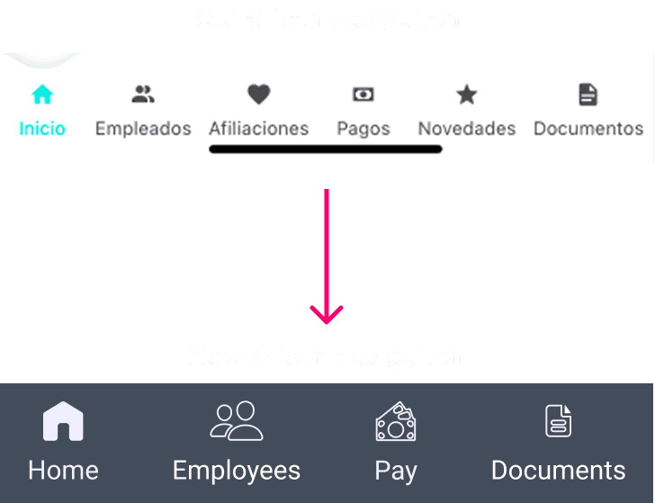
Smarter Navigation: Less Clutter, More Clarity
Reducing cognitive load and improving accessibility
We knew that by simplifying the navigation, we would address several usability issues while helping map out our task flow focus. We started this conducting several card sorting sessions to further inform our design decisions regarding current navigation struggles.

The results revealed that users consistently grouped key tasks into just four or five logical categories, indicating that the existing six-button bottom navigation was overwhelming and unnecessary.
This insight, combined with our heuristic evaluation, highlighted an opportunity to consolidate redundant navigation paths, many of which led to similar destinations. By generalizing the “Employee” section and nesting related tasks within it,

This is why we streamlined the user journey and reduced cognitive load. Additionally, moving to a four-button nav allowed for increased touch targets and larger font sizes, helping us better meet accessibility standards and improve overall usability.
The results revealed that users consistently grouped key tasks into just four or five logical categories, indicating that the existing six-button bottom navigation was overwhelming and unnecessary.
This insight, combined with our heuristic evaluation, highlighted an opportunity to consolidate redundant navigation paths, many of which led to similar destinations. By generalizing the “Employee” section and nesting related tasks within it,
This is why we streamlined the user journey and reduced cognitive load. Additionally, moving to a four-button nav allowed for increased touch targets and larger font sizes, helping us better meet accessibility standards and improve overall usability.


Old Navigation
New Navigation


Define
Learn More
Define
Learn More
The Moment Most Users Quit - And How We Fixed It
A data-driven redesign of Symplifica’s most abandoned task
With our research revealing a staggering 80% abandonment rate during the enrollment process and the insights we gained from both users and stakeholders, we knew that we could deliver the greatest return on effort for both user satisfaction and business KPIs by narrowing our redesign focus to simplifying the employee enrollment process because:
It’s the gateway to using the platform, so if users don’t complete it, the rest of the app is irrelevant.
It’s filled with confusing legal steps, jargon, and unclear value propositions.
It directly affects the business’s core conversion metric and support ticket volume.
In our updated experience, we reduced the number of screens required to complete enrollment while still capturing all necessary information. We also identified the points where users frequently contacted support and proactively addressed these with clear, concise info boxes to guide them through the process with confidence.
Portion of the old enrollment process
Portion of the old enrollment process

New enrollment process

Our next step was to take all of the valuable insights and conduct an affinity mapping session to group user quotes, behaviors, and frustrations into meaningful categories that would factor into our user persona. Four themes emerged:
Fear of wasting money due to employee turnover
Desire to offer real value (not just compliance)
Uncertainty about app usage and functionality
Concern over workplace safety and liability
This helped us better understand emotional blockers and shifted our design strategy toward reassurance, flexibility, and visibility into value. It also informed our design strategy based on two user personas.
i make my employees food, i offer them bonuses, i buy them gifts and i accommodate their schedules/ lives
i try to make sure there are additional perks (when working for me) because it matters to take that stress off of somebody
I was injured but my employer didn’t care
I have felt unsafe in the workplace environment and shared my location
high turnover would be difficult to deal with for the sake of constantly finding new employees
i like to play around in apps and figure it out
When I have an issue in the app I go to the FAQ sections
Short-term hires with no commitment are a challenge
Ideate
Learn More
Ideate
Learn More
Framing the Future
Sketches and Wireframes
With a simplified flow in place, we turned our focus to structure and clarity, translating the new experience into tangible screens. We began sketching and wireframing early ideas that prioritized ease of use, reduced cognitive load, and aligned with how users naturally complete key tasks. These low-fidelity iterations helped us quickly explore and validate new layout strategies before committing to polished designs.


Ideate
Learn More
Ideate
Learn More
Framing the Future
Sketches and Wireframes
With a simplified flow in place, we turned our focus to structure and clarity, translating the new experience into tangible screens. We began sketching and wireframing early ideas that prioritized ease of use, reduced cognitive load, and aligned with how users naturally complete key tasks. These low-fidelity iterations helped us quickly explore and validate new layout strategies before committing to polished designs.
Hi-fidelity Design
Learn More
Hi-fidelity Design
Learn More
Hi-fidelity Design
Learn More
Bringing the Vision to Life
Bringing the Vision to Life
Final Design
Final Design
Building on user feedback and usability insights from the low-fidelity wireframes, we refined the interface with real content, visual hierarchy, and accessibility best practices. Our high-fidelity designs aimed to feel intuitive, familiar, and supportive for users with limited tech confidence like Gabriela.
Building on user feedback and usability insights from the low-fidelity wireframes, we refined the interface with real content, visual hierarchy, and accessibility best practices. Our high-fidelity designs aimed to feel intuitive, familiar, and supportive for users with limited tech confidence like Gabriela.
The original home screen left users guessing with a cluttered layout, inconsistent styles, and no clear hierarchy making it hard to know where to start. In our redesign, we prioritized clarity and action with simplified visuals, consistent UI patterns, and guided entry points now help users confidently navigate and take the next step with ease.
Results
Learn More
Results
Learn More
Gabriela's New Prime Experience
What Changed and Why
Old Home Screen
Old Home Screen

New Home Screen
New Home Screen

By introducing 6 targeted UX improvements that simplify navigation, build trust, and reduce friction, we were able to meet both business goals and user needs - helping users confidently complete key tasks and decreasing reliance on support channels.
Simplified Navigation
We streamlined the bottom navigation from six to four clearly labeled icons to reduce cognitive load and make wayfinding more intuitive for users.
Prime experience Highlighted
Prime benefits were reframed as emotional and financial incentives, helping users immediately see the value of membership and motivating conversions.

Contextual Help and Support
We added persistent Help Center access and contextual tooltips to empower users with timely answers, reducing support volume and abandonment.
Simplified Navigation
We streamlined the bottom navigation from six to four clearly labeled icons to reduce cognitive load and make wayfinding more intuitive for users.
Prime experience Highlighted
Prime benefits were reframed as emotional and financial incentives, helping users immediately see the value of membership and motivating conversions.
Contextual Help and Support
We added persistent Help Center access and contextual tooltips to empower users with timely answers, reducing support volume and abandonment.
Clarifying Error Messages
Improved error states now use contrast, iconography, and plain language to guide users in correcting form inputs and successfully submitting them.

Accessibility Improvements
Text color and size were adjusted across screens to ensure better readability and inclusion, particularly for users with visual impairments.
Prime Savings Display
We emphasized top-tier savings early in the process to better communicate the financial value of upgrading and drive informed decision-making.
Clarifying Error Messages
Improved error states now use contrast, iconography, and plain language to guide users in correcting form inputs and successfully submitting them.
Accessibility Improvements
Text color and size were adjusted across screens to ensure better readability and inclusion, particularly for users with visual impairments.
Prime Savings Display
We emphasized top-tier savings early in the process to better communicate the financial value of upgrading and drive informed decision-making.
Results
Learn More
Results
Learn More
Gabriela's New Prime Experience
What Changed and Why
The original home screen left users guessing with a cluttered layout, inconsistent styles, and no clear hierarchy making it hard to know where to start. In our redesign, we prioritized clarity and action with simplified visuals, consistent UI patterns, and guided entry points now help users confidently navigate and take the next step with ease.
Old Home Screen
Old Home Screen
New Home Screen
New Home Screen
Old Home Screen
New Home Screen
By introducing 6 targeted UX improvements that simplify navigation, build trust, and reduce friction, we were able to meet both business goals and user needs - helping users confidently complete key tasks and decreasing reliance on support channels.
Simplified Navigation
We streamlined the bottom navigation from six to four clearly labeled icons to reduce cognitive load and make wayfinding more intuitive for users.
Prime Experience Highlighted
Prime benefits were reframed as emotional and financial incentives, helping users immediately see the value of membership and motivating conversions.
Contextual Help and Support
We added persistent Help Center access and contextual tooltips to empower users with timely answers, reducing support volume and abandonment.
Simplified Navigation
We streamlined the bottom navigation from six to four clearly labeled icons to reduce cognitive load and make wayfinding more intuitive for users.
Prime experience highlighted
Prime benefits were reframed as emotional and financial incentives, helping users immediately see the value of membership and motivating conversions.
Contextual help and support
We added persistent Help Center access and contextual tooltips to empower users with timely answers, reducing support volume and abandonment.
Clarifying Error Messages
Improved error states now use contrast, iconography, and plain language to guide users in correcting form inputs and successfully submitting them.
Accessibility Improvements
Text color and size were adjusted across screens to ensure better readability and inclusion, particularly for users with visual impairments.
Prime Savings Display
We emphasized top-tier savings early in the process to better communicate the financial value of upgrading and drive informed decision-making.
Results
Learn More
Results
Learn More
Results
Learn More
Bringing It All Together
Bringing It All Together
Key Takeaways and Next Steps
Key Takeaways and Next Steps
Key Takeaways: Clarity Builds Confidence
Key Takeaways: Clarity Builds Confidence
Fixing the “Affiliate an Employee” flow proved that one thoughtful change can create a ripple effect. By streamlining a process where most users dropped off, we didn’t just improve completion rates, we eased the load on the call center and restored user trust.
What we uncovered was simple but powerful: Users wanted to comply, they just needed clarity.
Refining the flow, simplifying the UI, and reducing cognitive load gave users the confidence to move forward. In this context, visual consistency wasn’t just aesthetic, it was also a powerful way to signal reliability in a space filled with legal and financial complexity. This redesign not only improved business metrics, it helped users feel empowered to formalize employment with ease and assurance.
What’s Next: Supporting Users Beyond the First Flow
What’s Next: Supporting Users Beyond the First Flow
With a stronger foundation in place, Symplifica is looking ahead to ensure every user touchpoint continues to feel intuitive, supportive, and trustworthy with their next focus areas including:
In-app guidance: Adding info buttons and contextual tips so employees can learn as they go.
Smart reminders: Implementing homepage notifications to help users stay compliant with local labor laws.
Education as empowerment: Expanding tutorials and resources that demystify formal employment and reinforce user confidence.
Employee-side optimization: Aligning the employee experience with the employer interface to reduce confusion and improve consistency.
Clearer pricing: Refining membership cards so users instantly understand value and cost.
Together, these next steps move us closer to an experience that truly meets users where they are while Symplifica continues making legal employment accessible, understandable, and actionable for everyone.

Lessons from Beyond the Screen
It was a privilege to be able to work with Symplifica. At the start, I was excited to get the chance to practice my Spanish! Then, as I learned more about Symplifica and their mission to empower domestic workers in Latin America, I knew this work would mean a lot to me and to the people that Symplifica helps.
As the project went on, I deepened my understanding of the challenges faced by domestic workers in Columbia and the importance of formalizing their employment. And, while working within a 3-week timeframe can be tough, it is a true testament to the important role that empathy plays in creating positive user experiences - something that was critical to connect with user needs and deliver meaningful improvements. The lovely Symplifica leadership team gave us a crash course in Colombian labor laws and I developed a profound appreciation for the culture's emphasis on community and collaboration.
I am proud to have had the opportunity to contribute to Symplifica’s cause to prioritize the needs and well-being of domestic workers and make life better for everyone - it is an important one! CreatIng an intuitive and valuable user experience for meaningful initiatives like this is something I hope to be part of again very soon!
Lessons from Beyond the Screen
It was a privilege to be able to work with Symplifica. At the start, I was excited to get the chance to practice my Spanish! Then, as I learned more about Symplifica and their mission to empower domestic workers in Latin America, I knew this work would mean a lot to me and to the people that Symplifica helps.
As the project went on, I deepened my understanding of the challenges faced by domestic workers in Columbia and the importance of formalizing their employment. And, while working within a 3-week timeframe can be tough, it is a true testament to the important role that empathy plays in creating positive user experiences - something that was critical to connect with user needs and deliver meaningful improvements.
The lovely Symplifica leadership team gave us a crash course in Colombian labor laws and I developed a profound appreciation for the culture's emphasis on community and collaboration. I am proud to have had the opportunity to contribute to Symplifica’s cause to prioritize the needs and well-being of domestic workers and make life better for everyone - it is an important one! CreatIng an intuitive and valuable user experience for meaningful initiatives like this is something I hope to be part of again very soon!
Lessons from Beyond the Screen

It was a privilege to be able to work with Symplifica. At the start, I was excited to get the chance to practice my Spanish! Then, as I learned more about Symplifica and their mission to empower domestic workers in Latin America, I knew this work would mean a lot to me and to the people that Symplifica helps.
As the project went on, I deepened my understanding of the challenges faced by domestic workers in Columbia and the importance of formalizing their employment. And, while working within a 3-week timeframe can be tough, it is a true testament to the important role that empathy plays in creating positive user experiences - something that was critical to connect with user needs and deliver meaningful improvements. The lovely Symplifica leadership team gave us a crash course in Colombian labor laws and I developed a profound appreciation for the culture's emphasis on community and collaboration.
I am proud to have had the opportunity to contribute to Symplifica’s cause to prioritize the needs and well-being of domestic workers and make life better for everyone - it is an important one! CreatIng an intuitive and valuable user experience for meaningful initiatives like this is something I hope to be part of again very soon!
Next Case Study
Reimagining Roku
Advancing Roku’s mobile app into a social second-screen hub. Focused on creating a more engaging, user-centered experience beyond your standard remote with features that connect, organize, and personalize streaming for over 145M users.
Case Study
Learn More
Simplifying Symplifica
Bringing Clarity, Compassion, and Compliance to Domestic Work in Colombia

Case Study
Learn More
Simplifying Symplifica
Bringing Clarity, Compassion, and Compliance to Domestic Work in Colombia
Next Case Study
Next Case Study
Reimagining Roku
Advancing Roku’s mobile app into a social second-screen hub. Focused on creating a more engaging, user-centered experience beyond your standard remote with features that connect, organize, and personalize streaming for over 145M users.